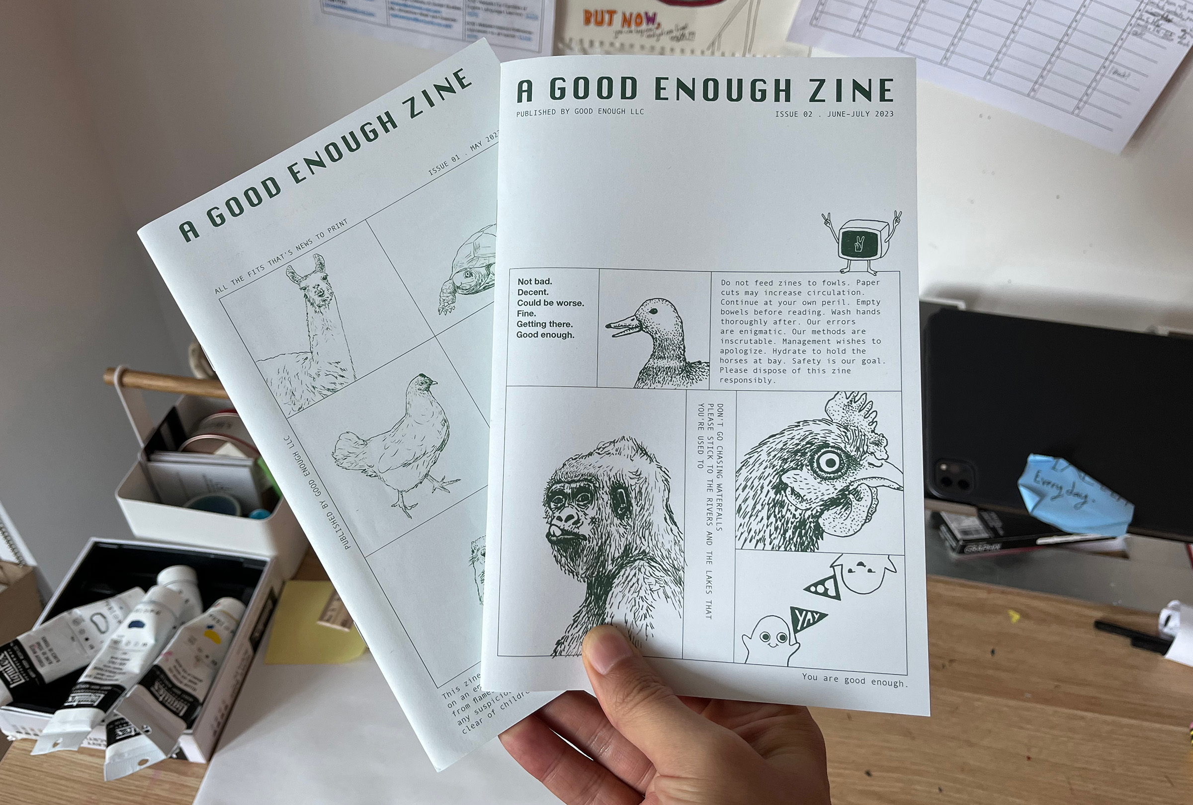
We made a zine!
The first issue was released in August, and I finished the second issue just last week. Right now, a hundred copies are on their way from the printer to me (update: they've just arrived!). Today I'd like to share the story of how this zine came about.

Bad Idea: Zine
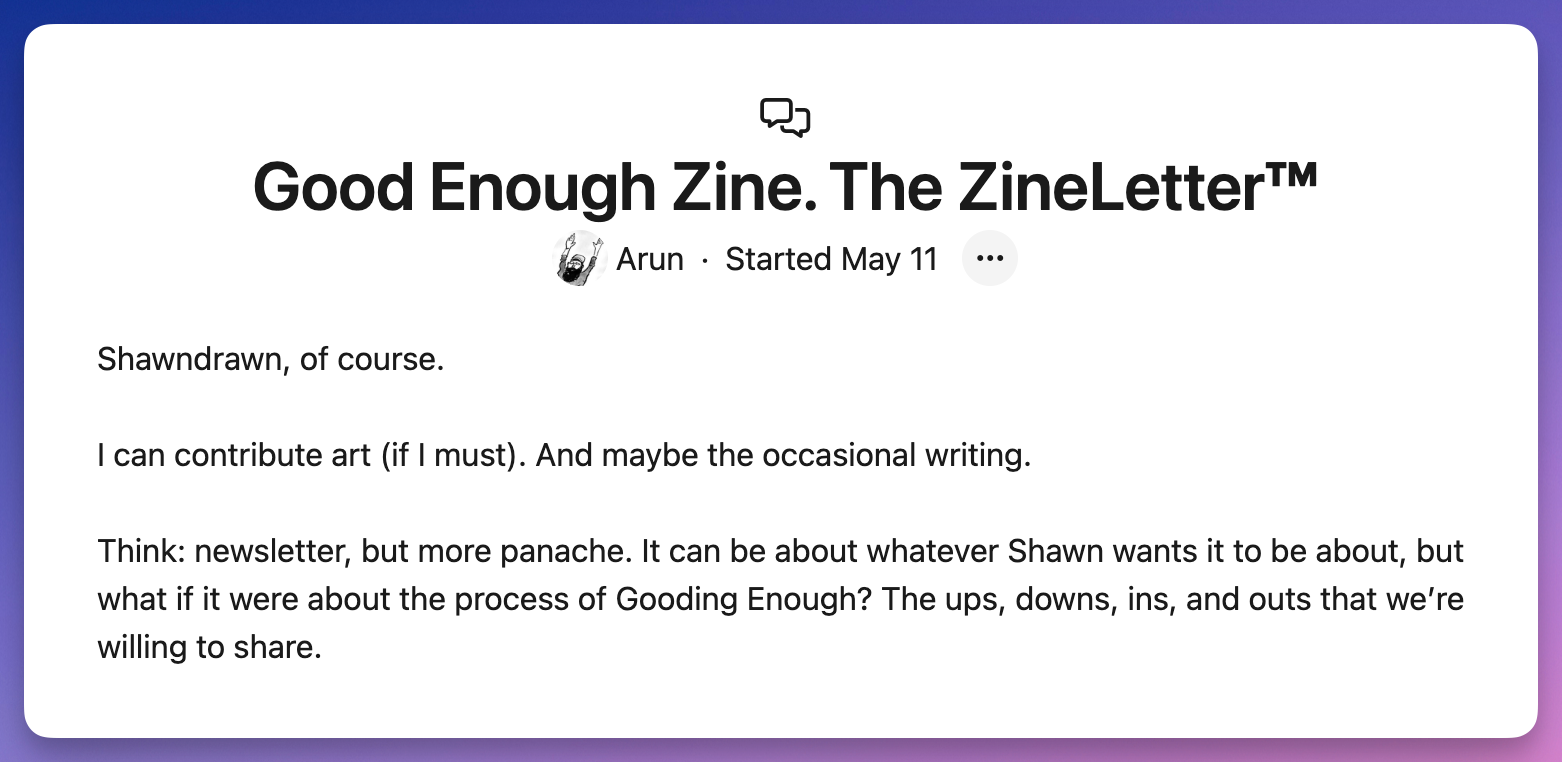
A Good Enough Zine was one of our bad ideas. On May 11, 2023, Arun suggested:

My initial reaction: What a terrible idea!
Why so terrible? Because making a zine is a sh*t ton of work. (I know—I've made several issues of a comics zine, and it is a lot of work!) And really, who's reading zines these days and who cares about what we're doing at Good Enough?
But later that night, when I told my wife about Arun's bad idea, she said, "You have to do it!" She reminded me that I love collecting and reading zines, and that I'd be all over a zine made by another small business like ours. As for the work involved––well, what else am I doing at Good Enough besides hanging out with my friends? (It's not like I'm coding or anything. 😅)
What about Who cares? I mean, we do! We're making this zine for ourselves, so that we have a physical object for our time together as Good Enough. Most of our work-lives happen in the cloud. Things on the internet are ephemeral. So this zine will be a keepsake. Maybe we'll show it to our kids (and maybe even our grandkids?).
How the Zine Was Made
A Good Enough Zine is composed of screenshots, photos, and lots (lots!) of words. The work is mostly done manually: I have to remember to take screenshots of our video calls, save interesting Slack conversations, ask people for photos, and capture early prototype designs.

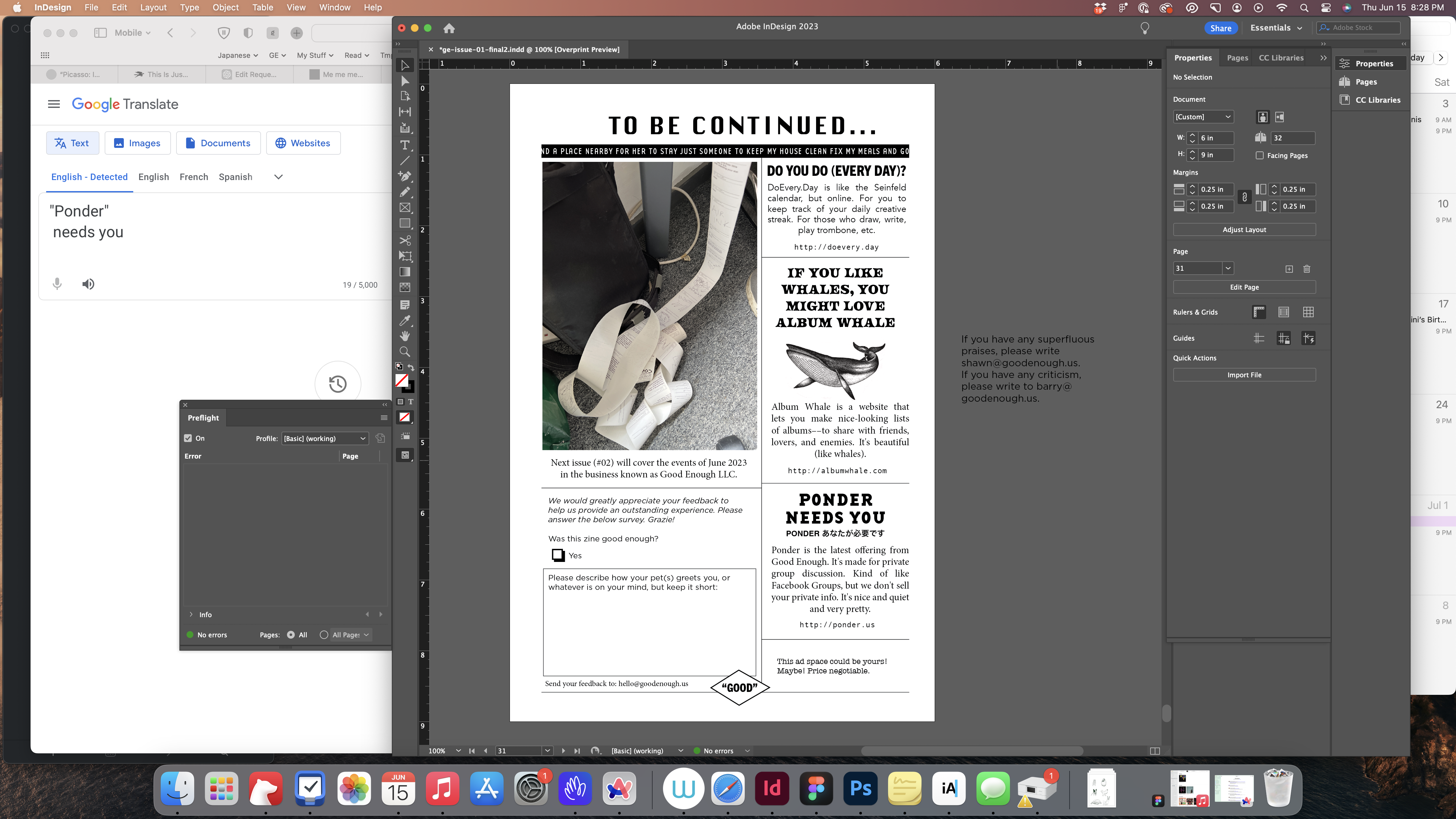
Most of my zine-making occurs in Adobe InDesign, and occasionally in Photoshop and Illustrators. (While there might be better software out there, I've been using the Adobe Suite for over two decades and have gotten too used to them.) For most of the illustrations in both issues, I drew in Procreate on iPad. But for the second issue's cover, I hand-drew the illustrations—curious how that will come out.
I often print pages and cut them to size to get a feel for how they look in real life. Our home printer, a cheap Epson inkjet, is serviceable, but its print quality is far worse than commercial printers. This has been a problem for me to choose the right font weight and line thickness for my illustrations: while they might look the way I want in the prints at home, the letters or lines can end up looking too thick or too thin in the final product.
For those who are typographically inclined: for the first issue, I settled on Gotham for the main body text, but I didn't like how it looked once printed, so I changed it to Helvetica Neue for the second issue. The fixed-width font is Andale Mono. And the title font is Susan Kare's Chicago.

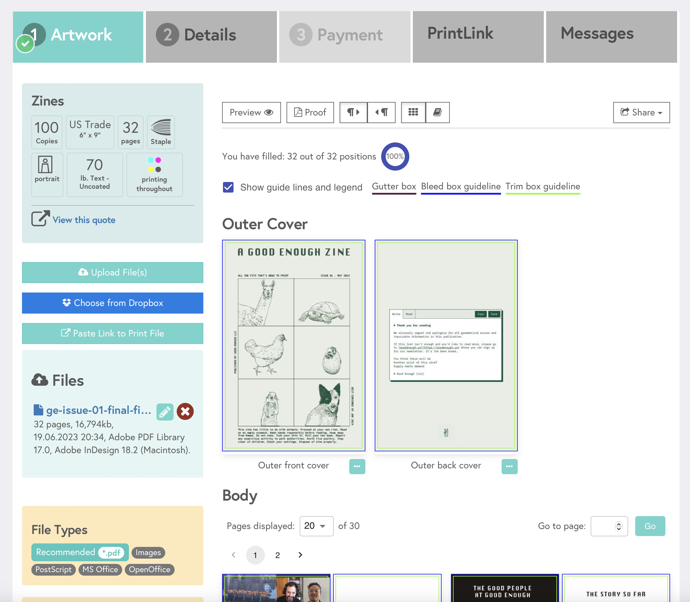
We're using Mixam to print the zines because their site is fast & easy. It cost us about $416.94 to print and ship 100 copies of the first issue. Here are the specs:
- 32 pages, staple binding
- Size: 6" x 9" (US Trade)
- Full-color printing
- Uncoated 70lbs paper
For the second issue, we're using slightly thicker paper. I'll report back on how we like it.
Here's a zine-making tip (the only one I can think of right now): remember to set bleed in InDesign!
Feel free to write us if you have any questions. And if you'd like to know when future zines appear, subscribe to our newsletter!