I’ve said this before: We’re primarily a web shop here at Good Enough, but occasionally we come up with ideas that we think would work really well as a native desktop or mobile application. Still, we prototype those ideas on the web first.
Recently, I wanted to try and make one of these web prototypes look and resemble a native Mac app as much as possible. My first inclination was just not to use any CSS at all, but that’s pretty limiting. Then I found CSS System Colors.
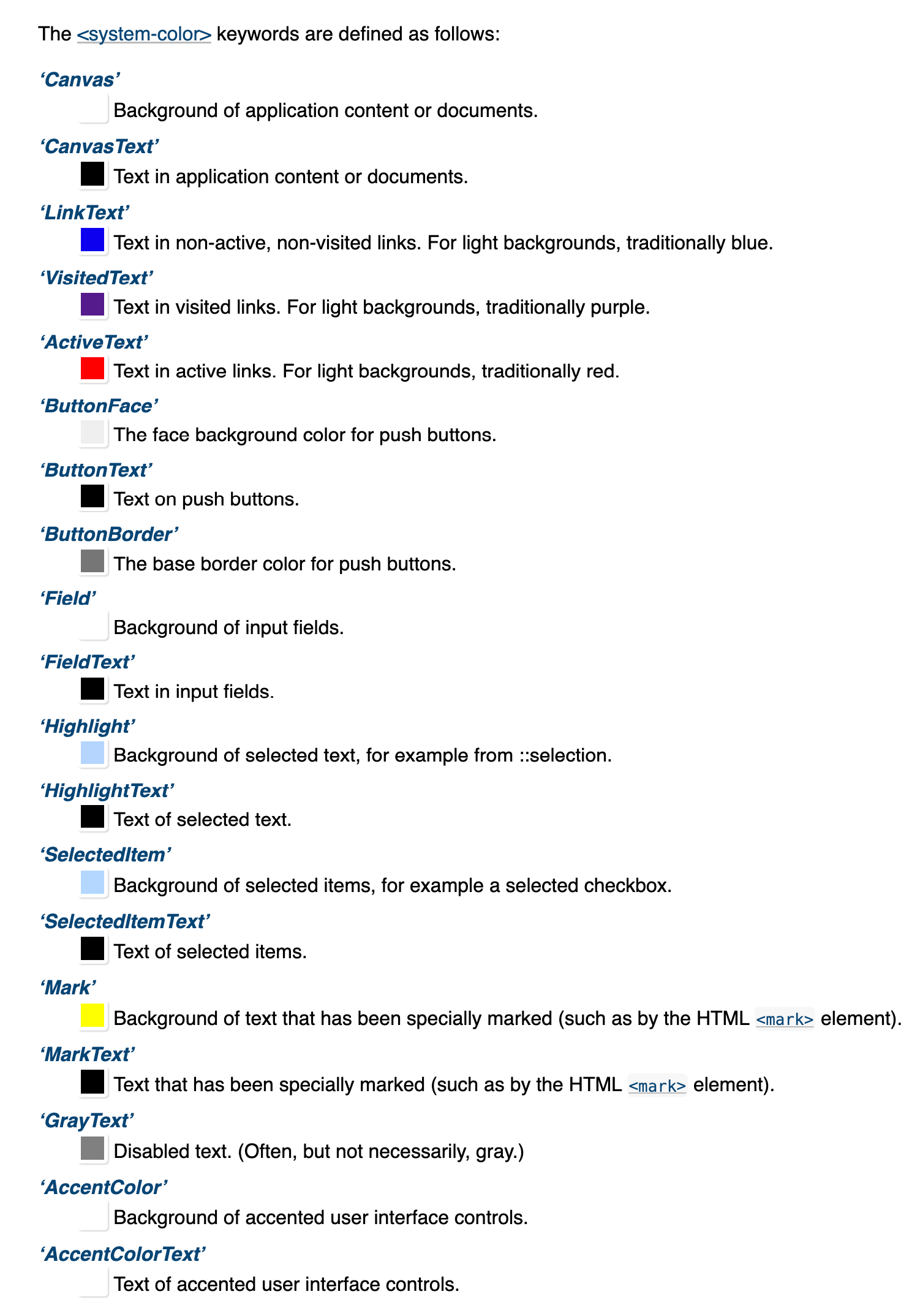
With CSS System Colors, you can use special color names that translate to color choices made by the user, the browser, or the OS, effectively giving each user the look of their own OS. This seems powerful, even beyond my prototype. I was excited! Here’s all the currently available system colors as of this writing:

Here’s what I expected when I tried CSS System Colors:
“My web designs match native system styles that work well, look good at all times, and keep the user in control of what they see.”
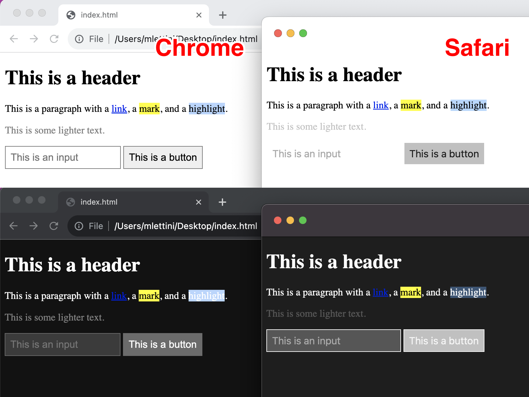
But here’s what I actually got when using CSS System Colors:
“My web designs look entirely different in every browser, they’re mostly inaccessible in dark mode, and nobody has actually changed any of these colors away from their defaults.”
Here’s a shortlist of some issues across Chrome and Safari with the default system colors:
- Dark mode highlights how differently they’ve been implemented in the two browsers. Colors that don’t match there include
Canvas,GrayText,Highlight,Field,ButtonFace,ButtonBorder, etc. - Safari just uses white for
ButtonBorderinstead of a more sensible color, which doesn’t look good in either light or dark mode. - Safari also makes
GrayTextnot accessible in light or dark mode. - Safari also makes
ButtonFacewithButtonTextnot accessible in dark mode. Why doesButtonTextget dark mode support (changes to white) but notButtonFacedoesn’t change at all? - Chrome is mostly OK, but
HighlightwithHighlightTextisn’t accessible in dark mode. - And the big issue:
LinkTextisn’t accessible in either browser in dark mode.

Now all of these issues can be fixed manually in your CSS with media queries, but the effort required on your part as a developer to circumvent them is not trivial (and we didn’t even get into mobile iOS vs Android). The idea is pretty cool, but just not reliable right now. Mayhaps one day browser teams will provide better support. If you do use them, I implore you to do a lot of testing in different browsers and environments.
If you’d like to read more about CSS System Colors, Jim Nielsen has a great blog post on the subject.