Hello reader, I’m Matthew, the newest member of Good Enough (LLC). The rest of the team are avid writers and sharers… I’m not. But they keep chanting “One of us. One of us.” so I suppose you’ll see me around here sometimes.
For my inaugural post, I thought I’d quickly share what I did in my first few days to win their affection. We’re working on Album Whale, and to help me get familiar with the codebase I jumped right in and started making changes to the CSS/SASS. Here’s what I did:
- Alphabetized all style properties
- Removed the CSS reset
- Added dark mode
Alphabetize
How CSS properties should be ordered is (and probably always will be) a debated topic. Should border rules be defined next to padding and margin, because it impacts the box model?
div {
  background-color: red;
  color: white;

  width: 100px;
  height: 100px;

  border: 2px solid blue;
  padding: 50px;
  margin: 50px;
}
Or should border be defined near the background, because it impacts what the element looks like on the page?
div {
  background-color: red;
  border: 2px solid blue;
  color: white;

  width: 100px;
  height: 100px;

  padding: 50px;
  margin: 50px;
}
Order debates can get really hairy when you have a team of people working on multiple stylesheets across an organization, especially if they don’t agree. That’s when style guides are written up, and maybe a linter is added to flag mistakes or re-order properties somewhere in the deploy pipeline.
As a designer, I try to write my code for other people to read and easily understand. The best way I’ve found to do this with CSS is something everyone can already comprehend: alphabetical order. This is the primary way most people organize a list of anything else, why not CSS properties too?
When navigating multiple large stylesheets that are constantly changing from multiple developers, I’ve found this ordering of properties to be the best option:
div {
  background-color: red;
  border: 2px solid blue;
  color: white;
  height: 100px;
  margin: 50px;
  padding: 50px;
  width: 100px;
}
Alphabetical order means you can skim faster, and are less prone to missing something––you don’t need to read the entire list of style properties to find where the previous unknown author put the “border” property, you can just look where the “b” words should be. It’s what our eyes are trained to read.
If your team struggles in this department, I highly suggest giving alphabetical ordering a try. You get used to it over time, and eventually appreciate the balance it provides.
Bonus: Here’s a handy way to tell VS Code to alphabetize style properties on file save.
Normalize
There’s a lot of writing out there already on Normalizing vs Resetting CSS, so I’ll make this section quick. These are two different starting bases for the styles you will be applying:
- Normalizing CSS fixes some browser inconsistencies, but by and large retains most default browser styling for all HTML elements.
- Resetting CSS removes any and all styling for HTML elements, letting you build it all from scratch with total control.
Both ways are valid and have their own pros and cons. So which should you choose? It depends on what you’re building:
- Normalize CSS if your website will primarily have a lot of text and articles and writing. Default browser styles are all in the service of making an HTML page readable on its own, so make it easy on yourself and start from that base.
- Reset CSS if your website is primarily an application, dominated by forms and buttons and interactive elements. You don’t want default styles getting in the way here.
We think of Album Whale lists no different than curated, published articles. We’ve even recently added a layout that’s better suited for writing long-form notes about each album. So I ripped out the reset from the stylesheet. Less code = happier team.
Dark-mode-itize
All the major desktop and mobile OSes now support dark mode, and that’s a huge win for everyone. My eyes are so thankful every evening when the bright windows and apps on my monitor automagically turn dark as the sun goes down——I don’t even know what time this happens at, that’s how seamless it is.
However, I’m blinded every time I then open Gmail and it’s still in its default white theme.
Most websites on the internet don’t support dark mode yet, and it’s a travesty. Some websites, like Gmail, have a dark theme, but require me to go in and change the theme manually. What do they think I am, a sucker? I just close the tab.
Luckily, the CSS working group has made supporting dark mode easy for developers, to the point where websites that don’t should be declared persona non grata. Just use the dedicated media query:
div {
  color: black;
}

@media (prefers-color-scheme: dark) {
  div {
    background-color: black;
    color: white;
  }
}
That’s all it takes. I really like this method because it follows what the user has already told their OS they prefer——they don’t have to manually choose their theme on your silly website. It’s accessible and user-friendly.
Of course, this can get tricky to implement on a large codebase. To make it simple, you should be abstracting your colors into variables across your whole stylesheet:
:root {
--bg: #fff;
--color: #333;
}
@media (prefers-color-scheme: dark) {
:root {
--bg: #111;
--color: #eee;
}
}
div {
background-color: var(--bg);
color: var(--color);
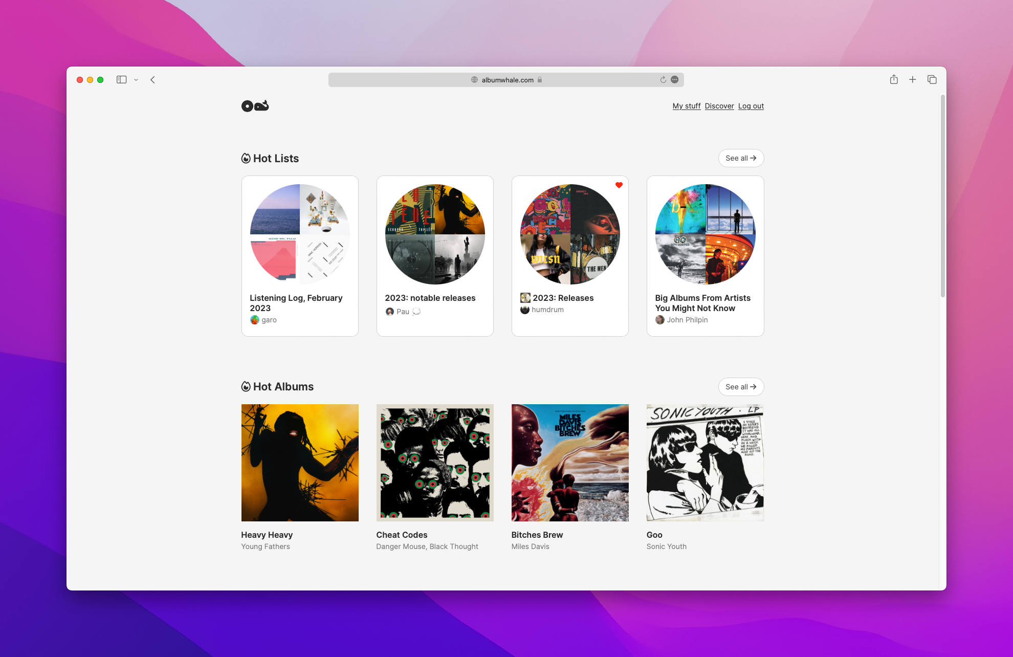
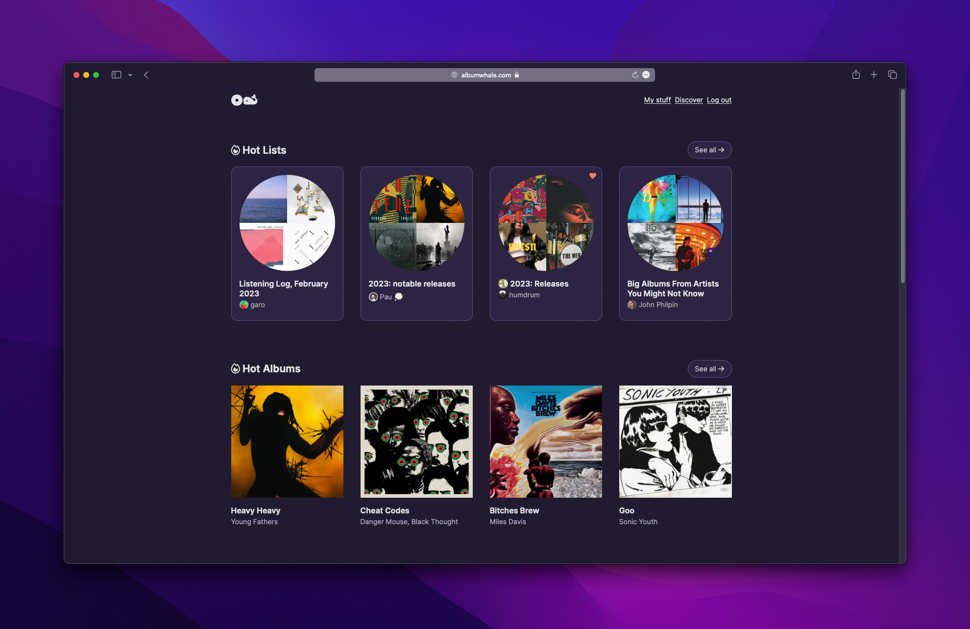
}Album Whale’s stylesheet already had about 60% of its colors abstracted into variables, so I merely made that 100% and then added the dark mode media query. Done in about day. It blew Shawn and Barry’s mind. Look at the difference and those beautiful purples:
There’s a lot of design considerations that go into dark mode. If you want a more in depth breakdown of developing for dark mode, CSS Tricks is always the place to go.
So that’s what I did in my first few days of Album Whale.
Bye.